For this task, we were put into groups in order to create a short animation. I was in a group with Shannon McAfee, Rebecca McEwan and Patrick Moorhead. In the beginning, we all came up with our own ideas and then as a group decided on the one we liked best.
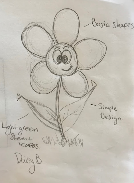
My initial idea: Growing Pains.
Plot -
As the sun rises, we see two little flower sprouts growing from the grass. As the sun gets higher in the sky the two daisy yawn as the bloom. They look at one another and smile. Daisy A grows taller than daisy B. Standing proud daisy A looks down at B.
B becomes jealous and sprouts up even taller with her flower getting bigger. Shocked daisy A grows taller with an even bigger flower and sticks it’s tongue out at B.
Annoyed B struggles to try and grow again to bet A but instead, another leaf pops out!
Daisy A starts laughing hysterically. Daisy B frowns in sadness when Suddenly a pair of scissors appear out of nowhere!
Scared Daisy A stops laughing looks up at the scissors and screams when SNIP! Daisy B slowly opens its eyes to see A is gone and starts to giggle and smiles standing proudly in the garden.
Character Design:
Rough Shot List
- *Morning Bliss music in the background
https://youtu.be/_RM7cQCC4sU * - Est shot garden ... title Growing Pains fades on and off screen.
- Ls zoom ms of daisy yawning
- CU smiling at each other
- LA of A grows taller
- CU of B jealous expression
- HA LA Quick cut back and forth of daisy outgrowing each other tracking shot
follows A - Ms Of B struggling pop pans down at leaf and back up at B face
- Cuts to MS of A laughing
- Cu B sad eyes closed
- *Music change to something like psycho
https://youtu.be/cyIxdOctioo * - Quick paced CU of scissors then back to A’s face
- ECU snip
- Ms B slowly opening eyes
- Pans out Ls showing A gone
- *Back to morning bliss song*
- B starts giggling then smiles yes closed grinning ear to ear with head raised to
the sun. Fades to black the end
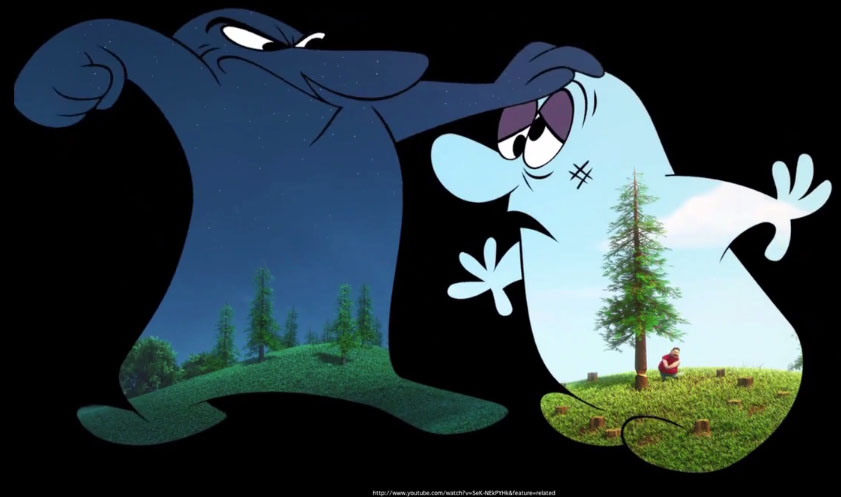
We all decided that our initial ideas were based on two characters that have a conflict between one another as they personalities are complete opposites. In the end, we all decided to go with Becca's idea in the end 'Cliffhangers.'
Conflicting characters inspiration:
'Day and Night'

'Presto'
'A love story'
Research and Development.
Rebecca's Cliffhanger Idea as seen below:
Character Design:
Storyboard:
For the animatic, I animated from 14-26 seconds.
The animatic was a good way for us to see how to improve our storyline as a group in order to get the best possible outcome of our short. After presenting the animatic to our class we got great feedback from our peer and Alec. They said that it wasn't that clear that they were window cleaners, so they suggested dressing the characters appropriately for their job with cleaning props. Alec suggested to us since the bird is going to end the short that we should make it more apparent throughout the short.
Once we got the feedback we decide in our next meeting to really look at the storyline, rework the characters and the design of the world.
We wanted there to be a clear difference between the two characters so I redesigned Trev into a girl window cleaner (as window cleanings usually viewed as a man's job).
But the more we thought about it the contrast of traditional vs modern should be more noticeable to the audience so we decide to change Trev from a human into a Robot.
Rebecca began the redesign of Trev into a robot and we just left Dusty the old man character the way he was originally designed because we loved the design so much.
 |
| Maya model |
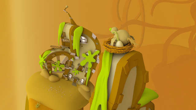
We all split up the modelling for the world and I got to design the houses for the world. Heres are some concept ideas that I had initially designed.
I also designed some environment concept art for our world, but we later realised it made the world feel more of a fantasy feel so wee scrapped the idea.
Maya House Model.


Presentaion of progress:
https://docs.google.com/presentation/d/1j4CKVA02fWGPNALOMzHavKhvlAp3zQE4Sj4OM2CjWIg/edit?usp=sharing
After our presentation, Alec gave me some feedback on the house. He said look at our inspiration (Dr. Seuss) and base the house more of our research images and change the window above the door it because it looked quite flat.
My redesigned versions of the house models drawing more inspiration from Dr Seuss.

In order to make the world more cohesive, we decided to make both of the house the same colours.
Final Progress Presentation:
https://docs.google.com/presentation/d/1w2vFFc54pDcr21lk_LSL9DIMVbTh7tkkkSegYDsZKB4/edit?usp=sharing
I helped rig Trev, in the beginning, I found it difficult navigating Maya when rigging the robot but the more I did it the easier it got. I will admit the mechanical lift got the better of me so we had to resort to simply scaling and moving the lift when needs be - which ended up working ok because you could only see the lift move at a distance.
We talked about change of colour palette - simplified, monochromatic yellow environment, characters that enter it will stand out immediately. We went through a lot of adjustments and tweaking to get this current version eg. changing colours, exaggerating the bird poo splats, making the background work etc.
Scene Assembly.
Once we had everything in place we were ready to animate. We decide to do the key placement of the characters throughout the short first - so when we divided up the shots the fluidity of movement would be cohesive throughout the entire short.
I animated shots 1,2,6 and 7.

I am really happy with how my shots turned out. Animating took about 3 days to complete which was a lot quicker than I imagined but because we had done all the hard work with the placement of the characters we just had to animate in between those frames.
Edit and adding sound.
I really loved editing and adding sound to our animated short, as sound really brings the animation to life even more. It also helps drive the narrative forward. It can be quite comical trying to find the yet sound for the clip but its just a lot of trial and error. When I first heard the window cleaning idea I immediately thought of the song by George Formby 'When I'm Cleaning Windows' to play in the background as Dusty pulls up in his van.
https://www.youtube.com/watch?v=dG1W1h5W17Y
I am so pleased with how our final animation turned out and I am super proud of our group. There was a couple of issue with the rigging in the beginning that set us back a bit but we stuck to our schedule and produce an aesthetically pleasing animation.
FINAL ANIMATION:


