Zine.
To find Inspiration for this project I went over to Pinterest and created a board of what I wished my zine would be based on.
 |
| Preview of my Pinterest. |
Illustrator Tutorial - We went to the Mac Labs and where shown various methods and tools on Illustrator that we may find useful when creating our zines.
These are my three experimental pages.
Journey - The things I enjoy, in the colour scheme I enjoy.
Page 1.
Inspiration - Lisa Madigan.


Madigan is an Australian Graphic and Design artist. She uses oils on linen to create her very expressionistic finger like paintings using colours that are very complimentary to one and other. It was her playful work that inspired me to try this method and have fun with it.
Making my Front Cover:
Final Outcome:
Page 2.
I really enjoy taking photos and posting them onto my personal Instagram page. So I got inspired from my Instagram layout and the burst of colour here and there.
 |
| My Personal Instagram. |
I decided to choose a photo I had taken of my friend when we visited Botanic Garden in Belfast, due to the gorgeous contrast between her bright pink coat and the various shades of green that surround her. (Very appropriate for my theme)
Final Outcome:
Page 3.
Graphic Shapes - I created a more simplistic page to compliment the more heavy imagery that will be placed beside it this page, as I wanted my zine to be quite balanced so when two pages are placed beside one another.
Final Outcome:
Page 4.
Artist Inspiration:
I really love the three dimensional aspect to all of the letters above but it was the letter H that i came across first that really inspired me for my forth page. When I found this letter I immediately began researching to see where it originated from and i was amazed to find out that it was part of the 36 days of type project.
Making Of Page 4:
- Create a X and begin cutting out the inside of the lettering.
- Place my Bamboo Plant underneath the X.
- Allow some of the leaves to poke out the letter.
- Experiment with lighting and different areas of the plant and capture the photo.

Final Outcome:
Page 5.
Artist Inspiration:
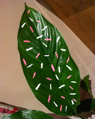
Sarah Illenberger - She is an Illustrator and designer and she inspire page five as she paints patterns onto real leaves. I had to look twice at her work as I honestly thought the whole picture was a painting when in actual fact if you look close enough you can tell the leaves are real with pattern painted onto them.

Recreating the pink and white sprinkle effect onto my own plant at home.
Instead of doing a block colour for the background like Sarah, I wanted to make it more original and full by adding a pink and white marble background in order to reinforce the colour scheme. To create the marble effect i simple went onto photoshop and took a pink and white strip background and then Liquified it in order to create the swirled marble effect.

Final Outcome:
Page 6.
Artist unknown.
This piece inspired page 6 as I really loved the white lettering in comparison to the dark photograph.
Final Outcome:
Page 7.
Artist Influence:
Tim Lahan - He is a Graphic Designer who is based in America. He like to create work that inspirse him and that is idea-driven rather than decorative work.
I loved his use of black and white imagery and then adding a pop of colour to make the work stand out and make it more aesthetically pleasing. He greatly inspired page 7 as I made the bottle of champagne in Black and white and added some pink bubbles and fizz to make it more interesting.
Final Outcome:
Page 8.
When experimenting with lettering in Illustrator I created a page that I didn't think i would have used but in the end I really loved how it turned out. The page that I had saved was then brought into photoshop just to add various shades of pink so it didn't look so flat.
BEFORE:
Final Outcome:
Page 9.
Photo that I had taken in the Botanic Greenhouse.
Experimenting with different backgrounds.

I felt this layout looked all over the place so I changed it to make it appear a lot cleaner.
Final Outcome:
Page 10.
When I first found out about our project I decide to make a cover page in my sketchbook to introduce the project and ended up really loving how it turned out so I wanted it to feature in one of my pages.
Page 11.
Original idea: I wasn't 100% happy with how it turned out so I went onto to Pinterest to find inspiration and I came across this pin.
Unknown Artist.
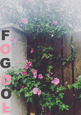
I loved the cross pattern in the first image so I decided to try it out on my own image of my back garden on a foggy day.
Final Outcome:
Page 12.
One of my favourite treats are Donuts, so I decided to take my photo that I had taken of my Dunkin Donuts donut when I was in NYC and paint it but using pink and green sprinkles instead.
I then brought it into photoshop and added some typography using Homer Simpsons favourite saying "DOH!" - the reason being his favourite snack is donuts like me.
Final Outcome:
Page 13.
I chose this image for the same reasoning behind Page 2.
To finish the photo off I added pink and grey borders.
Final Outcome:
Page 14.
One thing this generation can't live with out ... their phones and I am guilty of this too. Seeing as my phone cover is pink I decided to recreate it in illustration form. I then brought it into photoshop and created a pattern, personally I don't think the illustration itself is anything special its the pattern that makes it look more impressive.
Final Outcome:
Page 15.
Due to my obsession with plants i wanted to do a very simplistic illustration drawing and then bring it into photoshop and using the paint bucket tool simply fill it with pink, green and white to coordinate with my colour scheme. I really love how it turned out.
Final Outcome:
Page 16.
The original photograph I had taken:
I simply used Photoshop to change the colours of my image to suit my journey.
Final Outcome:


