Seoul.
I was in a group with Chloe, Travis and Shannon for the floating city project. We had mentioned different cities in the beginning but the first city that came to Chloe and I's mind was 'Seoul'. South is the capital of South Korea and it is a beautiful cultural enrich city with a modern twist.
For research, I got a book all about Seoul. It was filled with interesting statics and facts all about different places to visit in Seoul.
Research.
Lonely Plant: Seoul book - Found these pages good for continuing my research.
 |
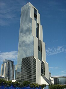
| Hyundai Global Business Centre |
Buildings that stick out.
 |
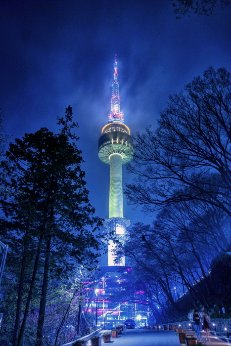
| Namsan Tower. |
 |
| Seongdong Cultural and Welfare Centre. |
 |
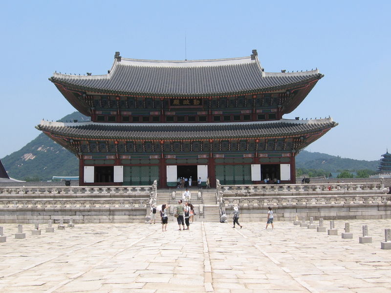
| Palais Gyeoungbok. |
 |
| Lotto Tower. |
 |
| World Trade Centre. |
Aesthetic.
Deciding on a style.
I looked to Pinterest for inspiration in order to decide on a specific style.


Chloe showed us this cute, light, low poly style. It tied in with Seoul well, since it’s so colorful and modern. We decided to stick to this simplistic style, I love the look of the densely packed cities with the vibrant buildings so we all decided to stick to this aesthetic.


I came across a Shell advertisement on Facebook that was so fitting with the aesthetic direction we were thinking of taking. With the style and vibrant colours of the separate cities. This advertisement as gave us a good insight into camera movement within this type of environment.


To make our work more cohesive we decided to stick to a pastel colour palette that Travis located.

Once we had decided to split the city into 4 section (Residential, Cultural, Landmarks and Commercial/Financial.) We split the workload between everyone, so each person got some buildings or environment things to make in Maya.
- I got the 'Base' that the city will be resting on.
- The 'Welfare Centre'.
- The 'Hyundai Business Centre'.
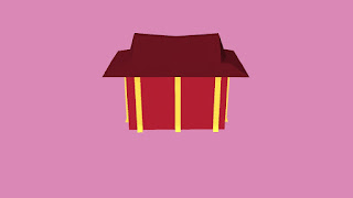
- Lastly a 'Generic Temple'.
Base Design :
 |
| Choosen Design. |
Maya progress.


Outcome of my Buildings
Cultural and Welfare Centre.
Generic Temple.
Hyundai Global Business Centre.
In the environment.


Infographics Information:
Sources -
https://www.indexmundi.com/south_korea/demographics_profile.html
https://www.skyscanner.com/news/explore-10-best-things-see-and-do-seoul
http://populationof2017.com/population-of-seoul-2017.html
http://www.citymayors.com/statistics/largest-cities-population-125.html
https://www.great-towers.com/towers/seoul-tower/
- Floating City - Seoul.
- By Travis, Chloe, Shannon and Megan.
- The capital of South Korea
- Population - estimated 10.6 million
- Namsan Tower - The symbol of Seoul and one of its most popular tourist attraction.
- Seoul is the 17th Largest City in the World.
- Home to Fortune 500 companies such as Hyundai.
- Religious Beliefs: Buddhism 43%, Protestants 34.5%, Roman Catholics 20.6% and Other 1.9%.
- Seoul is divided into 25 districts
- Home to $4.7billion K Pop industry.
I used After Effects to create the infographics. I used a quiver animation on the text which I feel tied in well with our quirky city. I attempted to create a circle graph to display the percentages of the different religions in Seoul. I followed a tutorial on how to make a circle graph. With more time, I would have parented the percentages to pop up at the same time as the designated section of the circle chart.
Chloe sourced a classic Korean calligraphy font for the opening title to try and tie the whole theme of the project together.
https://fonts2u.com/korean-calligraphy.font
Final Rendered Buildings and Base Located in the City.
Final Floating City Video.
https://youtu.be/ezjRRocEYLc
Reflection.
Overall, I feel like we achieved our goal in terms of the cute, simplistic, isometric aesthetic of the city and I was pleased with the final result of the city.
I was happy we chose Seoul, as it is a city that had already greatly interested me. For the first week of this project, I found it very difficult to make progress with Maya as the software was still foreign to me at that time. But once I made the generic temple, I attempted one of the more complex buildings in the city (the Welfare Centre) and I feel I did a good job. I understand I still need a lot of practice with the Maya but I am excited to see what I can produce in the future with more practice. With regards to the Hyundai Business Centre, seeing as it was just a plain glass-paneled building I wanted to make it look more interesting so I added a deeper purple from the colour palette to make the building stick out more.I rendered one scene on my MacBook to see if it could cope and the answer is not really as it heated up quite a bit but it rendered the 60 frames needed.
Furthermore, the editing of the clips took longer than expected otherwise we would have probably made our final video longer. If we had more time we could have made sure that each statistic matched up with what the audience was seeing on screen.
Lastly, again with more time, we could have done more animation throughout the city as the camera makes its way through the buildings however, I am happy with the outcome of our floating city.


